
Thoughts on creativity, culture, and visual storytelling.

Live to 100: Secrets of the Blue Zones
The title sequence of Live to 100: Secrets of the Blue Zones, crafted by Elastic.tv, delivers a visually striking introduction to the Netflix docu-series. Designed to set both tone and thematic resonance, the sequence reflects Elastic’s signature style—immersive, atmospheric, and rich in illustrative motion design. The visuals suggest the layered essence of the world’s longevity hotspots, evoking both place and spirit.
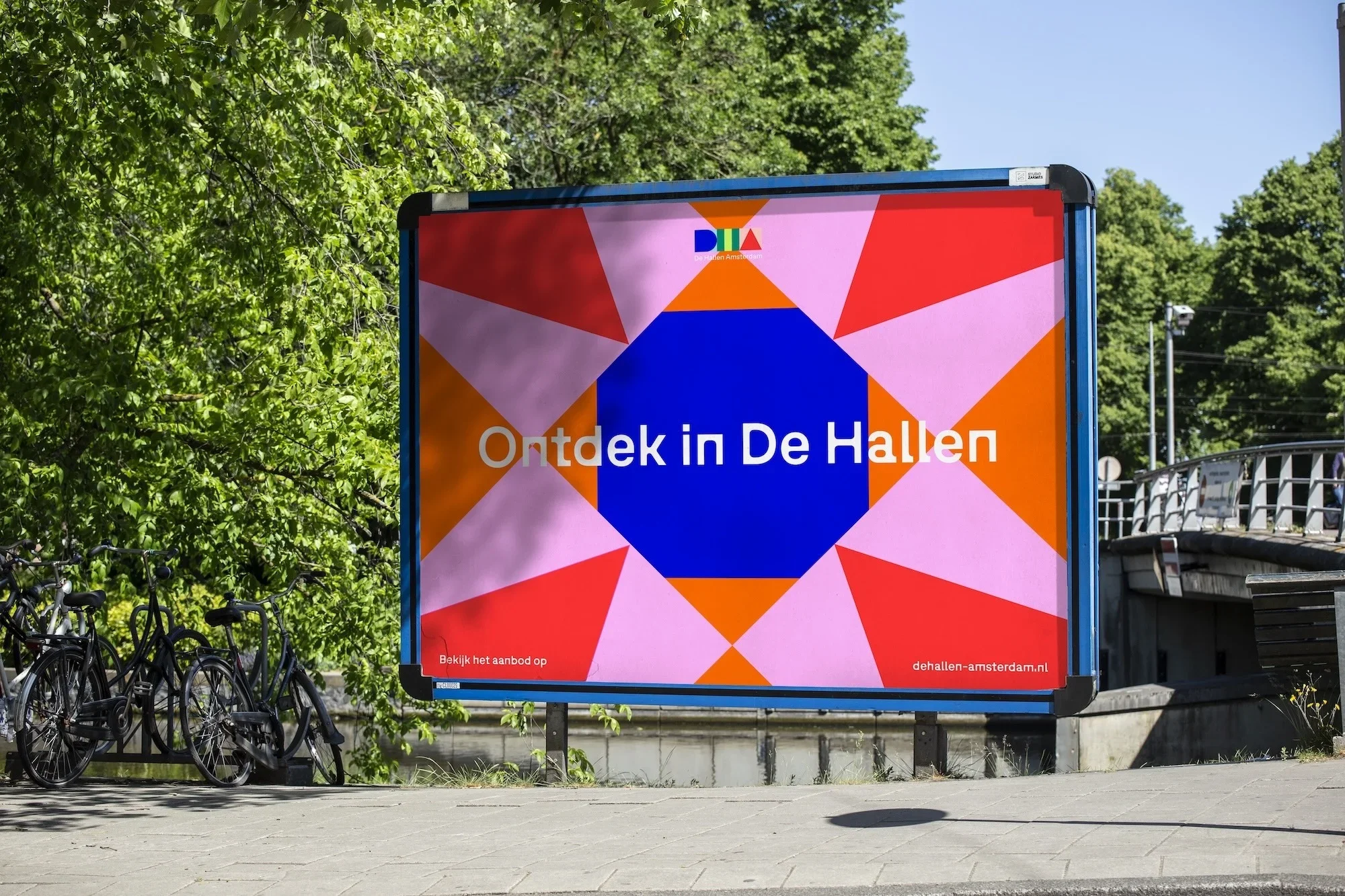
De Hallen Modular Identity Amsterdam
Amsterdam-based agency ON A DAILY BASIS created De Hallen’s new identity by drawing inspiration from the city’s tram system. The brief focused on expressing connection—between cultures, communities, and initiatives within the venue. The breakthrough came when the team noticed each Amsterdam tram line has its own shape and colour, originally designed for accessibility. This metaphor of movement and meeting became central, reflecting how people now gather where trams once converged.

Smörgåsbord Ajax rebrand
Smörgåsbord’s rebrand of Ajax Amsterdam takes direct inspiration from the football club’s philosophy on the pitch. Just as Ajax blends youthful energy with experience to create fluid, intelligent football, the design studio translated this ethos into what they describe as “total design” — a visual system unified by consistency yet built for adaptability and movement.

Norges Bank: The making of Norway's banknote
If ever there was a model graphic design process, this would be it. Norges Bank released an informative process film that explains the design and production of their brand new look bank note from conception to finish.
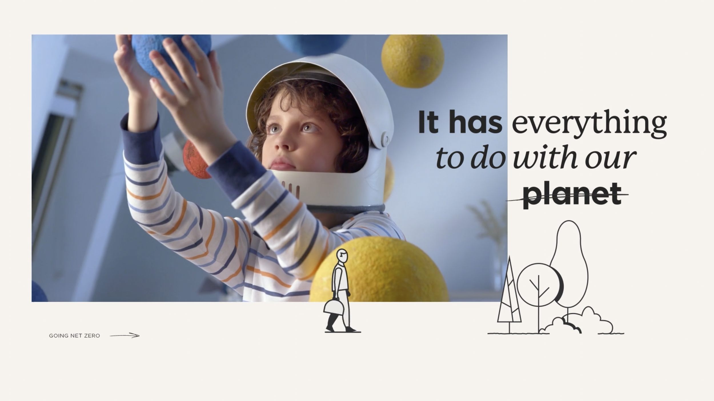
Edge—Net Zero
This film was created by Amsterdam-based studio PlusOne, the approach speaks about the social responsibility that the client - Edge has in the building and construction space.

Eurosport Masterbrand
DixonBaxi created an updated universal on-air brand identity for iconic European sports broadcaster Eurosport just ahead of the Beijing Winter Olympics 2022.
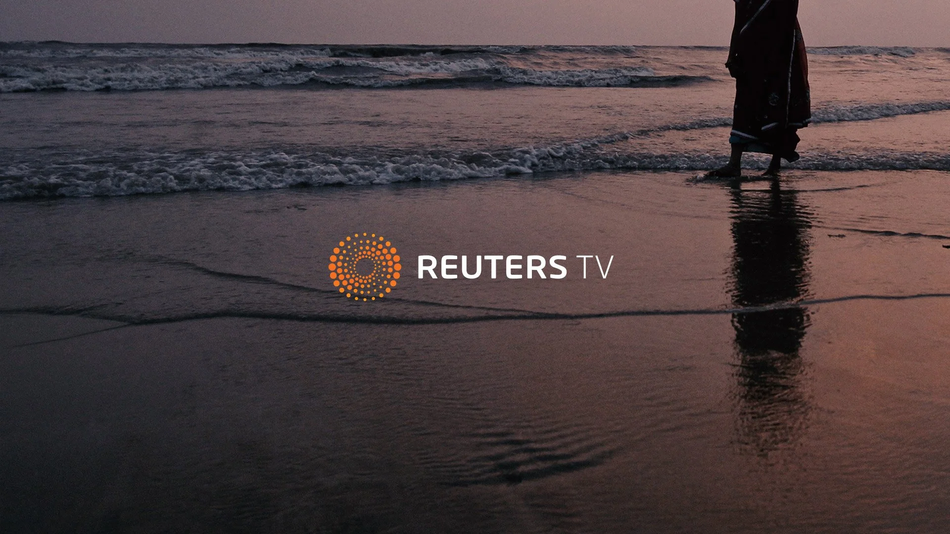
Reuters TV
Rare Volume developed a sophisticated broadcast design and software development system for Reuters TV (a real-time news programming platform) that just inspires. They led the design and production of graphics packaging for live-streamed video news including openers, transitions, interstitials, and categorical titling.

Dell/Nike AR
A short film directed by Erwin van den IJssel (Postpanic) shows an imaginary way AR could be used as a plausible use of Dell’s AR Demo (an interactive product simulation) in conjunction with Nike ID in the future.

The Prince Akatoki
A beautifully executed and well-considered hotel branding project by Interbrand Australia for The Prince Akatoki London, bringing together multiple mediums to present the concept, the execution pays homage and respect to Japanese culture and arguably, most crucially the hotel name (Akatoki meaning Dawn, in Japanese).

Irish Times Digital ‘QWERTY’
For the Times launch of their first digital-only daily edition in Ireland, Man vs Machine created a visual treatment driven by the 26 letters that make up a Keyboard 'QWERTY'. An engaging piece paying homage to the tradition and history of something that often goes unnoticed as the visuals take centre stage.

Borgen—Power & Glory
Benny Box of Copenhagen, designed and created the Main Title Sequence of the recent Danish political drama ‘Borgen - Power & Glory’.

Formula E
A fantastic on-air branding package, Dixon Baxi has executed a brother in branding terms to their Premier League rebrand alongside the in-house Formula E team. As we embark on the age of the electric car Formula E which has been around since 2012 delivers world-class racing to 11 cities over five continents, throughout the seven-month Championship season.

Sunderland ‘Till I Die
Sunderland ‘Till I Die, produced by Fulwell 73 and designed and animated by Alchemy in the UK.

Breakthrough Nat Geo
A very well-executed promo for the Breakthrough anthology series for National Geographic produced at Prodigal Pictures, directed by Danny Yount. Transitions in this are captivating and the level of detail is something to be admired, an extremely well-executed creative response. Link in title.
Apple—Don’t Blink
Sound marries motion to the maximum. Don't Blink is an exciting example of taking the traditional 'type in motion' format into a new dimension. French music producer Sukin provided the backbone to this piece. A track produced by Sukin called Tiger Rhythm was edited and spliced together with all sorts of appropriate sound bites, taking us on a roller coaster journey of sound and vision in an up-to-date 'Modernist' motion graphic presentation, drawing upon Apple's minimalist brand DNA as the principle graphic language.