
De Hallen Modular Identity Amsterdam
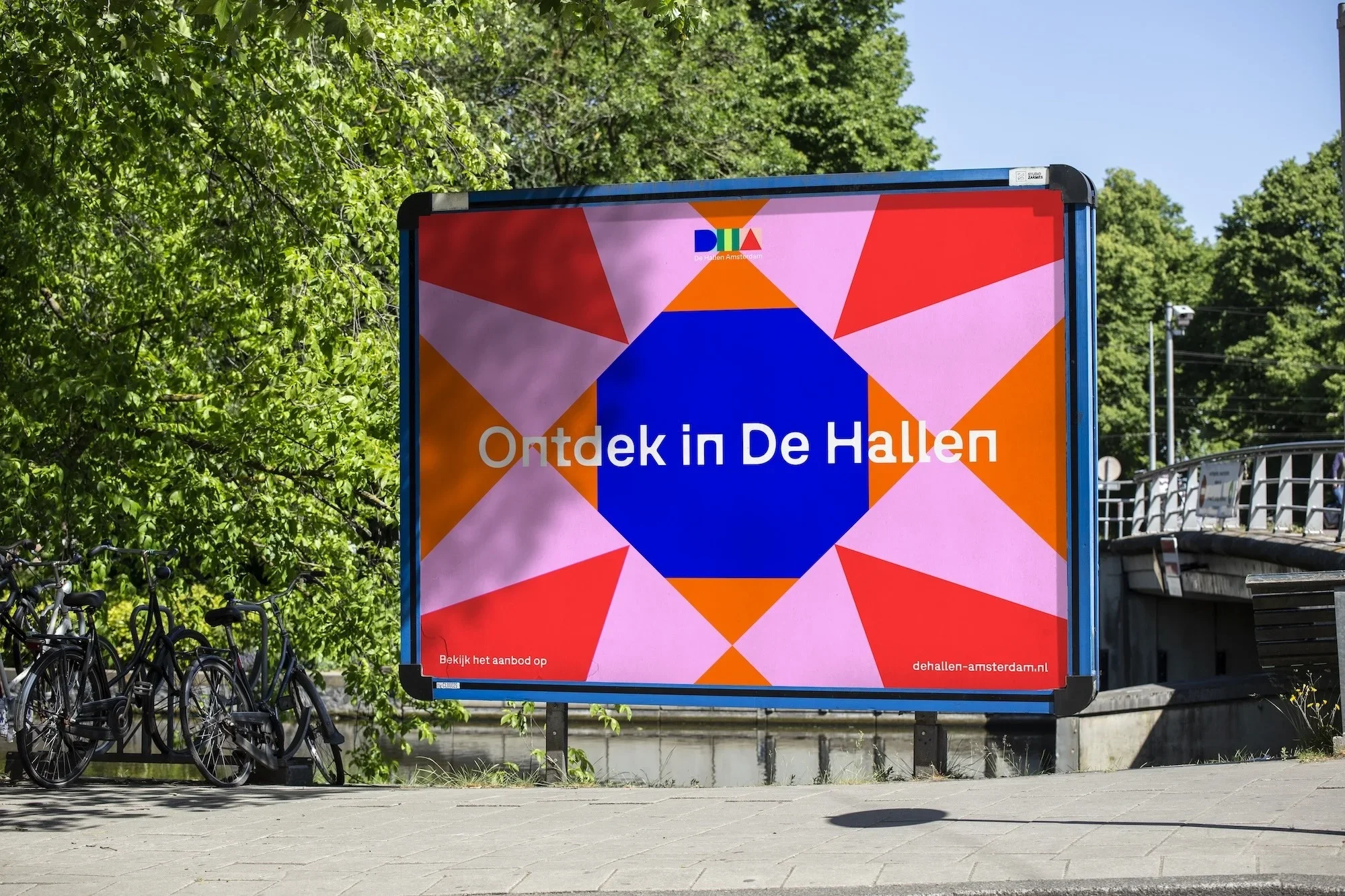
Amsterdam-based agency ON A DAILY BASIS created De Hallen’s new identity by drawing inspiration from the city’s tram system. The brief focused on expressing connection—between cultures, communities, and initiatives within the venue. The breakthrough came when the team noticed each Amsterdam tram line has its own shape and colour, originally designed for accessibility. This metaphor of movement and meeting became central, reflecting how people now gather where trams once converged. The identity system is built on three geometric forms drawn from De Hallen’s architecture—a square, arch, and triangle—allowing endless variation while maintaining coherence. Typography also plays a role, with Bugrino chosen for its balance of modernity and industrial character. To manage diversity, colours were anchored to Amsterdam’s neighbourhoods, creating local relevance and flexibility across contexts, from bold event campaigns to clear wayfinding. The modular system celebrates contrast yet unity, embodying De Hallen’s role as a vibrant meeting place. (Link in title).