
Smörgåsbord Ajax rebrand
Smörgåsbord’s rebrand of Ajax Amsterdam takes direct inspiration from the football club’s philosophy on the pitch. Just as Ajax blends youthful energy with experience to create fluid, intelligent football, the design studio translated this ethos into what they describe as “total design” — a visual system unified by consistency yet built for adaptability and movement.
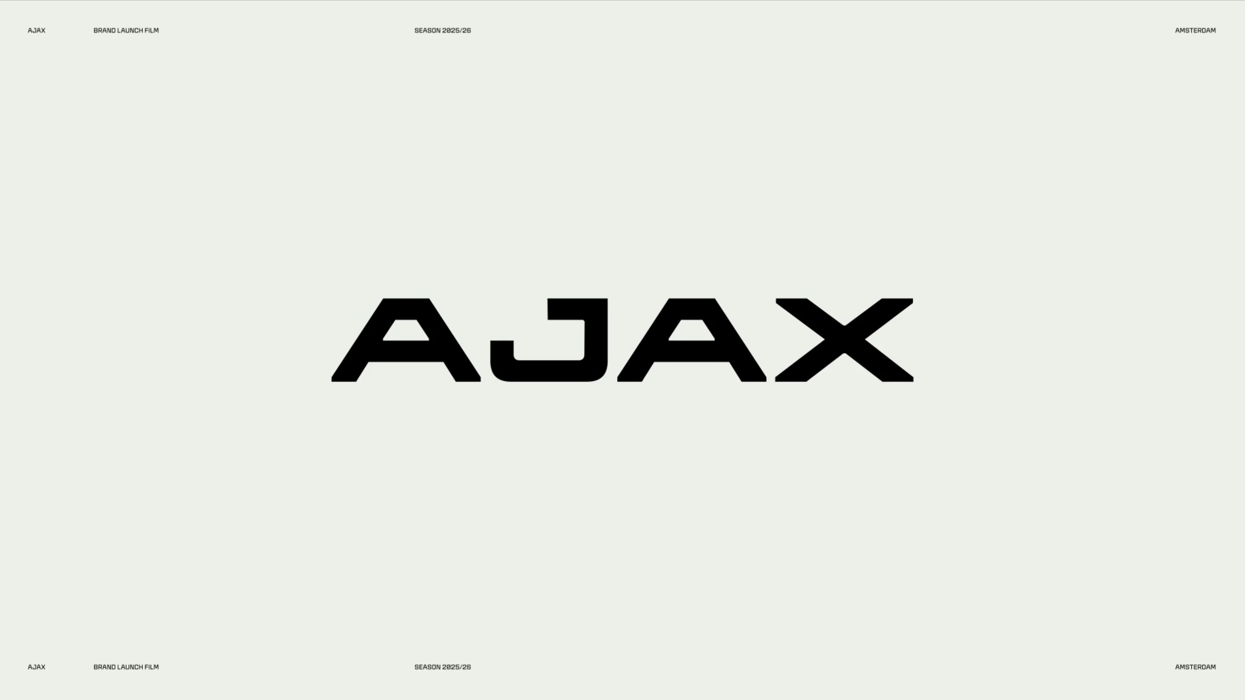
Typography lies at the heart of the new identity. Working with CoType Foundry, Smörgåsbord developed a custom font family spanning fifteen weights, versatile enough for broadcast graphics, signage, and digital platforms. The logotype itself references Ajax’s classic crest but is reinterpreted with contemporary precision. Creative Director Dylan Griffith explains that the team deliberately avoided the aggressive, italicised sans serifs typically found in sports branding, instead crafting a more editorial aesthetic marked by subtle craft details, such as vertical cuts and 45° bevels. The result is distinctly Dutch in character without leaning on clichés.
The studio immersed itself in Ajax’s world through extensive research in the club’s Jordaan neighbourhood and archive, ensuring authenticity. Their exploration extended beyond typography, challenging the club’s reliance on its red-and-white palette by introducing complementary colours — claret, salmon pink, gold, and coral — to give the design team greater expressive freedom.
Dual logotypes, custom iconography, and refined graphic language complete the system, which not only honours Ajax’s storied past but equips the club for modern expression across sport and lifestyle contexts. By merging heritage and innovation, Smörgåsbord positioned Ajax as more than a football team — a brand that embodies Amsterdam’s creative spirit. (Link in title).